
 ChatGPT
 Perplexity
 Claude
 Gemini
Poster Prompts for AI: 25 Copy-Ready Designs
Your AI image generator can make a poster in seconds, but the result is only as useful as the prompt you give it. A vague prompt produces a nice image with nowhere to put your headline, date, or price.
Each prompt below names the poster's purpose, its subject, where text should go, the color palette, and the aspect ratio. You get a layout you can actually finish. Whether you need an AI prompt for poster design or a quick template, the formula stays the same. Copy any prompt, change the details for your project, and generate.
Key takeaways
- A complete poster prompt answers six questions: purpose, subject, text placement, color palette, style, and aspect ratio.
- Quotation marks tell the model what text to attempt, but always check the spelling before you publish.
- Advertising and product posters need a clear call-to-action zone built into the prompt from the start.
- Keep generated text to two or three short words for the best accuracy, and add longer copy in a design tool afterward.
- OpenArt's AI image generator with GPT Image 2.5 handles in-image text more reliably than most models.
How to write a poster prompt
A strong poster prompt answers six questions before the model sees it. Skip any one and you usually get a beautiful image with no room for a headline.
The six-part poster prompt formula
Every poster prompt needs these six pieces. Miss one and you usually need a second generation to get something usable.
| Prompt field | What it controls |
|---|---|
| Purpose and format | Whether the model treats the output as a poster, a flyer, or a generic illustration |
| Subject | The focal point: a product, an instrument, a building, a seasonal motif |
| Exact short text | The words you want on the poster, kept to 2-3 words for accuracy |
| Layout and empty space | Where the subject sits, where the headline goes, and how much open area you get |
| Style and color | Art Deco, minimalist, hand-drawn, editorial, plus two or three named colors |
| Format and aspect ratio | The output shape: 2:3 for vertical print, 1:1 for Instagram, 9:16 for stories |
Weak prompt vs. strong prompt
Weak: "A jazz concert poster, Art Deco style, gold and black"
Strong: "A vertical Art Deco jazz concert poster for an evening performance, brass instruments and geometric shapes, midnight navy and warm gold palette, one large saxophone illustration in the lower half, generous open space at the top for the concert title, clear separation between the headline and event details, subtle ornamental border, portrait composition, 2:3 aspect ratio"
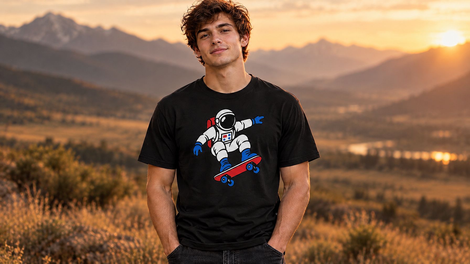
The weak version gives you a beautiful image. The strong version gives you a poster you can finish, because the layout is built into the request.
The poster prompt template
Use this fill-in-the-blank formula: [Poster purpose and format] for [event, product, or campaign], [central subject], [color palette], [composition and layout with headline placement], [visual style], [aspect ratio]
Advertising poster prompts
Advertising poster prompts carry one message. The prompt for poster design should make that message the center of the composition, with a clear zone for the offer and a call-to-action area.
1. Retail sale poster (bold graphic)
A bold retail sale promotion poster, strong geometric background in deep red and bright white, oversized product silhouette in the center, with the exact text "BIG SALE" in large block letters across the top, prominent empty banner space below for the discount percentage, smaller space at the bottom for terms and dates, high-contrast modern flat graphic style, clean edges, no photographic textures, vertical format, 2:3 aspect ratio
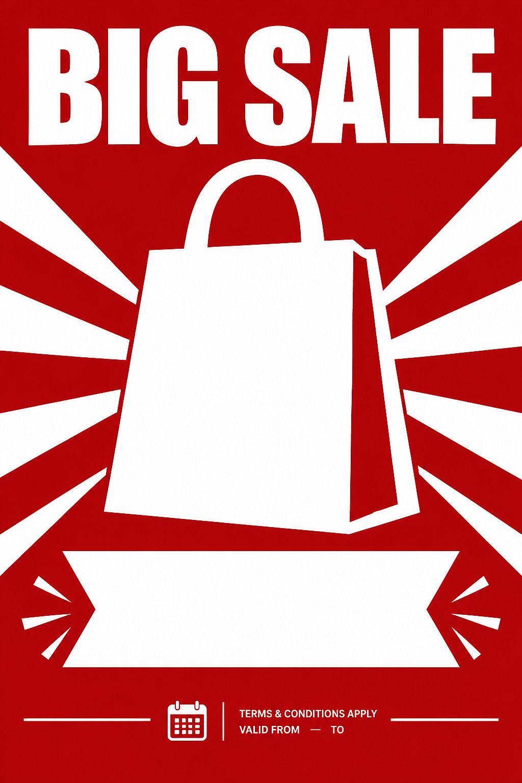
What this controls: The sale headline gets the biggest space. The product silhouette draws the eye to the center. The terms and dates sit at the bottom where shoppers expect them.
What to change: Swap the product silhouette and color palette to match your brand. Replace "BIG SALE" with your actual headline and check the spelling before publishing.
2. Product launch poster (editorial)
A premium advertising poster for a fictional skincare product launch, one elegant unbranded amber glass bottle on a pale stone pedestal, soft directional studio lighting, warm cream and muted green palette, product positioned in the lower-right third, clean negative space in the upper-left for a campaign headline, minimal editorial composition, no additional products or decorative lettering, vertical format, 2:3 aspect ratio
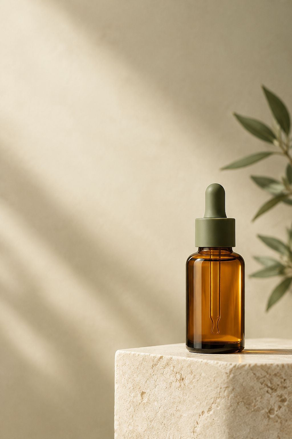
What this controls: The product sits in one corner while the opposite corner stays empty for your headline. Specifying "no additional products" stops the model from filling the frame with extra items.
What to change: Replace the product description with your real item. Upload a reference image alongside the prompt if you need closer accuracy.
3. App launch poster (flat digital)
A modern app launch advertising poster, a clean isometric smartphone illustration displaying a simplified fictional app interface, soft gradient background from pale lavender to light blue, the phone positioned in the lower-center third, wide open space in the upper two-thirds for the app name and tagline, small reserved area at the bottom for download badges and launch date, flat digital illustration style, no photographic elements, vertical format, 2:3 aspect ratio
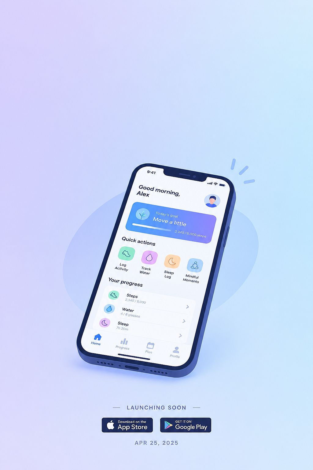
What this controls: The isometric phone sits low so the app name dominates the top. Flat illustration avoids the garbled text that AI-generated photorealistic screens often produce.
What to change: Adjust gradient colors to your brand. Add download badges in your design tool after generation rather than relying on the model to produce accurate store icons.
4. Real estate open house poster (residential)
A professional real estate open house poster, a wide shot of a bright modern house exterior with a manicured front lawn, warm afternoon sunlight, welcoming curb appeal, the house occupying the lower two-thirds of the frame, clear open sky in the upper third for the property address and open house date, small reserved banner at the bottom for the agent name and contact details, clean residential photography style, vertical format, 2:3 aspect ratio
What this controls: The house fills the lower frame while the sky provides natural negative space for the address and date.
What to change: Replace "modern house" with the property style (Victorian, cottage, loft). If you have a real listing photo, upload it as a reference and use an editing prompt to swap the sky or adjust the lighting.
5. Fitness class launch poster (athletic graphic)
A high-energy fitness class launch poster, a dynamic silhouette of a person mid-jump against a gradient background from deep navy to electric orange, bold graphic rays radiating from the figure, open horizontal banner at the top for the class name and schedule, smaller open area at the bottom for the gym location and sign-up details, modern athletic graphic design, sharp clean edges, vertical format, 2:3 aspect ratio
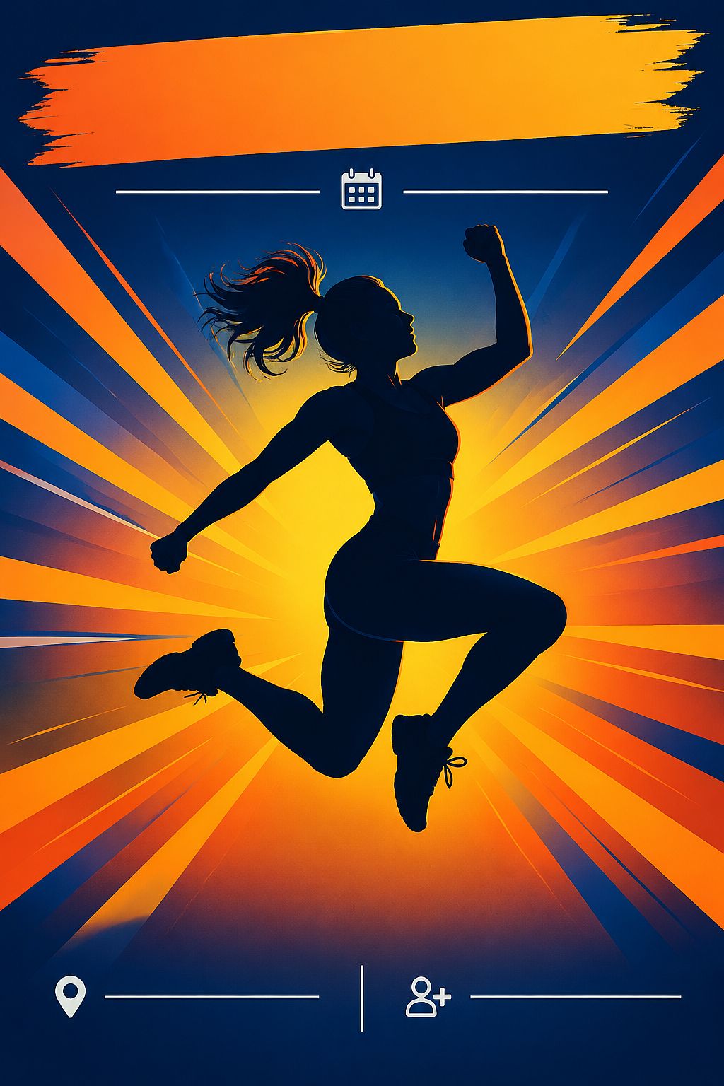
What this controls: The silhouette creates energy without showing a specific person's face. The banner at the top and details at the bottom give you two separate text zones.
What to change: Swap the silhouette activity (cycling, boxing, yoga) to match your class. Adjust the gradient colors to your gym's brand palette.
6. Restaurant grand opening poster (food photography)
A warm and inviting restaurant grand opening poster, a close-up of a beautifully plated pasta dish with fresh basil on a rustic wooden table, soft natural window light, terracotta and olive green palette, the dish occupying the lower two-thirds, clean open space in the upper third for the restaurant name and "Grand Opening" text, small reserved area at the bottom for the address and opening date, editorial food photography style, vertical format, 2:3 aspect ratio
What this controls: The plated dish sells the experience. The upper-third headline zone separates the brand name from the practical details (address, date) at the bottom.
What to change: Replace the pasta dish with your signature item and swap colors to match your interior. If you need the restaurant name displayed, add the exact text "YOUR NAME" to the prompt and check every letter.
Event poster prompts
Event poster prompts need a date, a venue, and a clear headline area. Your prompt should protect those zones so the model does not fill them with decorative elements.
7. Jazz concert poster (Art Deco)
A vertical Art Deco jazz concert poster for an evening performance, elegant brass instruments and geometric architectural shapes, midnight navy and warm gold palette, one dominant saxophone illustration in the lower half, generous uncluttered space at the top for the concert title, clear separation between the headline and event details, restrained ornamental border, sophisticated vintage print design, portrait composition, 2:3 aspect ratio
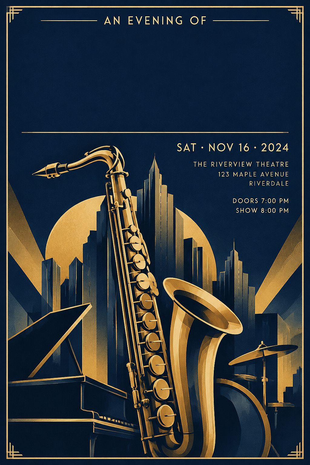
What this controls: The saxophone anchors the bottom while the top stays open for your headline, date, and venue.
What to change: Swap "jazz concert" and "saxophone" for your event type and focal object. A turntable for electronic music. A microphone for comedy. A stage for theater.
8. Tech conference poster (Swiss grid)
A contemporary technology conference poster with oversized geometric forms, cobalt blue, off-white, and charcoal, asymmetric Swiss-inspired grid, high-contrast central visual, large clean headline area across the upper third, separate space below for the event date and venue, generous margins, precise alignment, professional editorial graphic design, portrait orientation, 2:3 aspect ratio
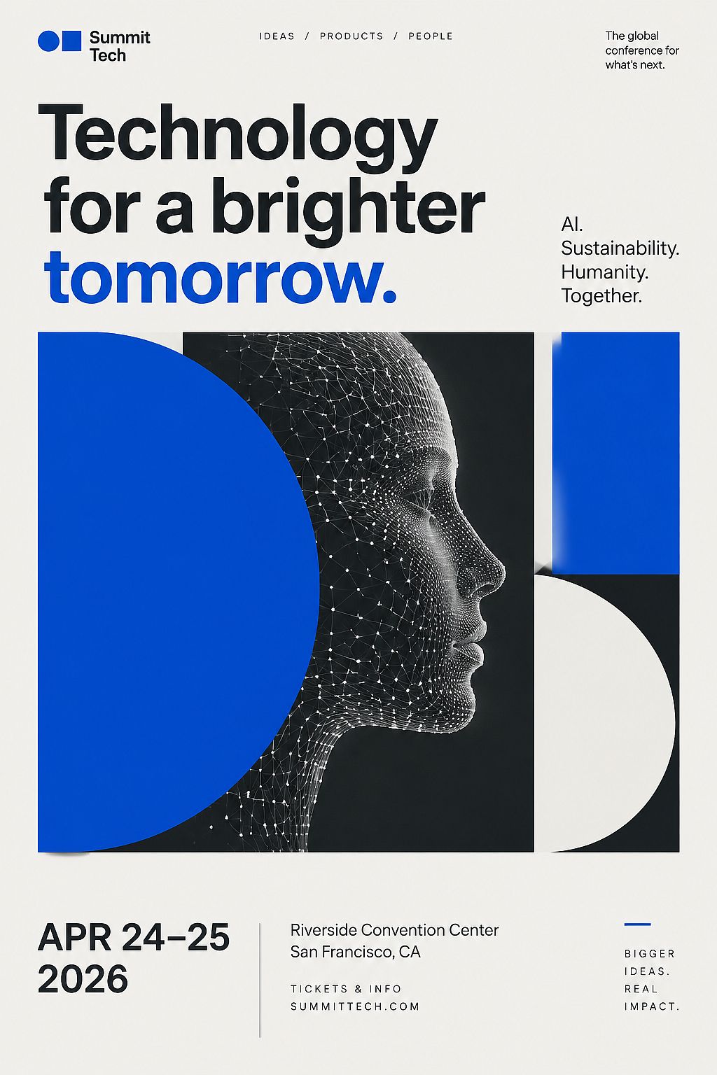
What this controls: The Swiss-inspired layout creates predictable zones for text placement. The headline area and the date space below it are specified separately.
What to change: Replace the color palette and central visual to match your conference brand. Add your event's theme (AI, sustainability, healthcare) as the visual subject.
9. Music festival poster (psychedelic)
A vibrant psychedelic music festival poster for a weekend outdoor event, swirling organic shapes and layered floral patterns, electric pink, teal, and gold on a deep purple background, a central open circle reserved for the festival name, secondary open band across the bottom for performing artists and dates, 1960s concert poster style with modern color intensity, vertical format, 2:3 aspect ratio
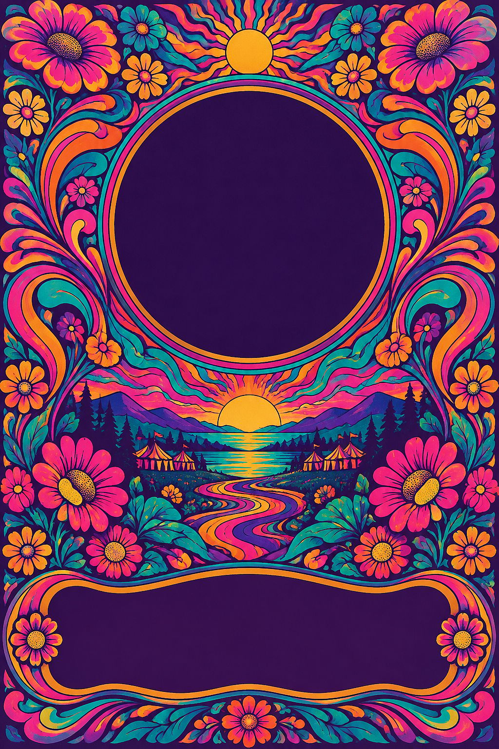
What this controls: The swirling patterns fill the edges while the central circle and bottom band stay open for text. The 1960s style gives the poster an immediately recognizable festival identity.
What to change: Swap the color palette to match your festival's branding. If you have many artists to list, widen the bottom band or move the lineup to a separate area.
10. Holiday charity gala poster (formal)
An elegant holiday charity gala poster, deep emerald green and warm metallic gold palette, a large ornate wreath framing the upper portion of the composition, soft candlelight glow throughout, open central area for the gala name and beneficiary, smaller reserved space at the bottom for date, venue, and ticket information, formal invitation style with subtle shimmer texture, portrait format, 2:3 aspect ratio
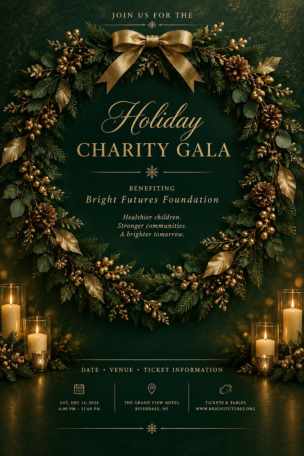
What this controls: The wreath frames the top while the gala details sit in the center. The emerald and gold palette reads as formal holiday without being specific to one celebration.
What to change: Swap "holiday" for your occasion (spring gala, anniversary dinner, annual fundraiser). Replace the wreath with a matching framing element (laurel branches, ribbon, architectural archway).
11. Art exhibition poster (gallery opening)
A refined art exhibition poster for a contemporary gallery opening, one large abstract paint stroke in vivid cadmium red on a clean off-white background, asymmetric composition with the paint stroke occupying the right two-thirds, generous empty space on the left for the exhibition title and artist name, small reserved area at the bottom for gallery name and opening dates, modern museum typography area, vertical format, 2:3 aspect ratio
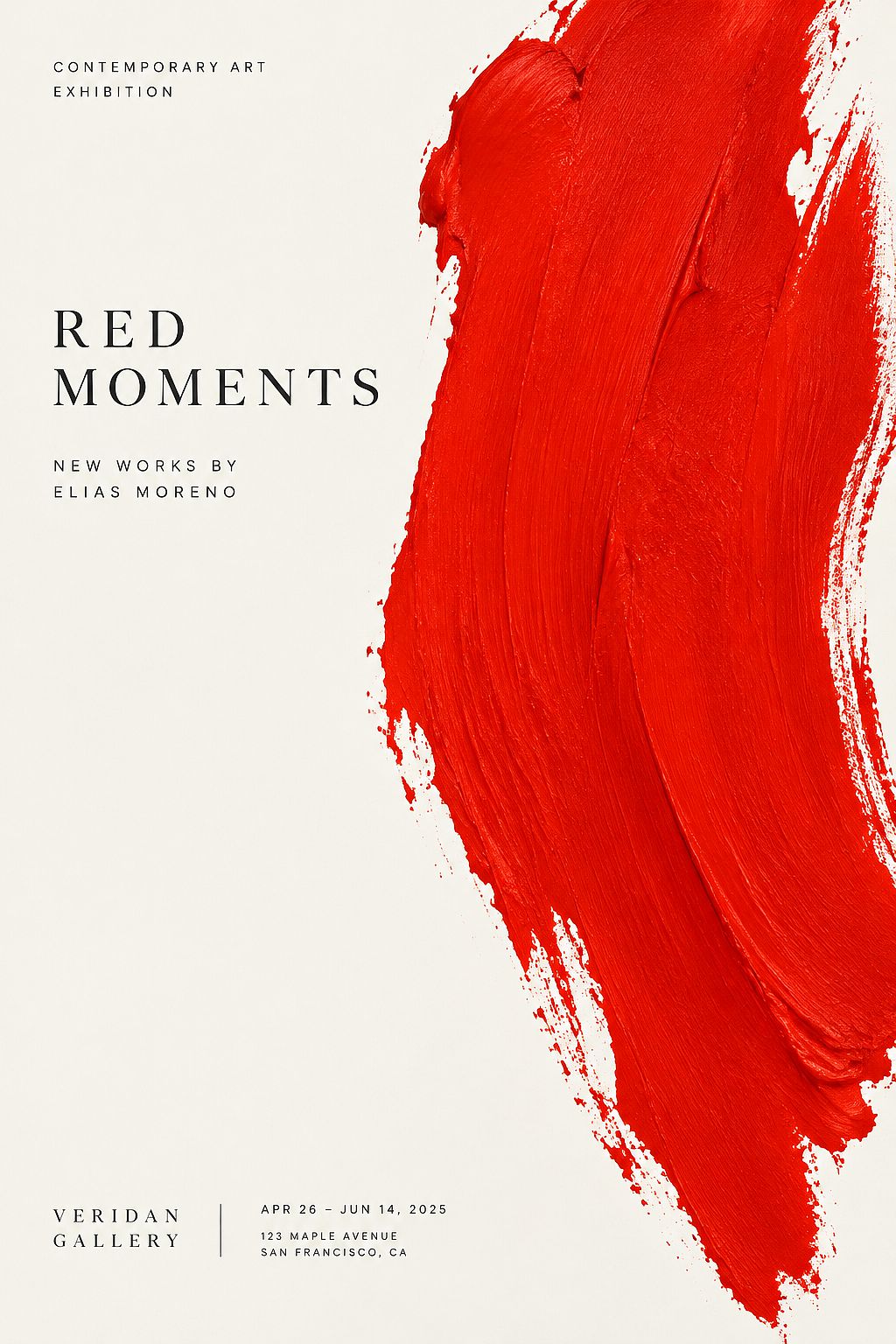
What this controls: The paint stroke becomes the visual hook while the left side stays completely open for text. The asymmetric split is a common gallery poster convention.
What to change: Replace the paint stroke with the featured artist's medium (sculpture silhouette, photographic close-up, geometric installation). Adjust the focal color to match the exhibition's identity.
12. Outdoor movie night poster (retro)
A nostalgic outdoor movie night poster, a large illustrated film projector casting a warm beam of light across the center of the composition, starry night sky background, deep navy and warm amber palette, the projector positioned in the lower-left corner, the beam of light creating a natural open area in the upper-right for the event title and movie list, small reserved strip at the bottom for date, location, and "Bring your own blanket" note, retro mid-century illustration style, vertical format, 2:3 aspect ratio
What this controls: The projector beam creates a diagonal text zone that feels organic to the poster's subject. The starry background sets the outdoor atmosphere.
What to change: Swap the projector for a drive-in screen silhouette if needed. Replace "outdoor movie night" with your event's name. Adjust colors for a summer or fall feel.
Product poster prompts
Product poster prompts need space for the item and a clear call-to-action area. These poster design prompts place the product deliberately so the layout stays open.
13. Coffee product launch poster (editorial)
A warm editorial poster for a specialty coffee product launch, a single steaming ceramic coffee cup centered on a dark wooden surface, rich espresso-brown and cream palette with a single accent of burnt orange, soft overhead lighting with a narrow depth of field, open space in the upper half for the brand name and roast description, no other objects on the surface, minimal composition, vertical format, 2:3 aspect ratio
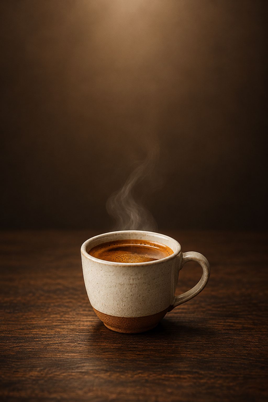
What this controls: The single cup draws the eye to the center while the upper half stays open for your brand name. Specifying "no other objects" prevents the model from adding beans or pastries that crowd the composition.
What to change: Replace the cup style and surface to match your brand. A paper takeaway cup on marble for a modern chain. A handmade mug on linen for an artisan roastery.
14. Sneaker drop poster (streetwear graphic)
A bold streetwear-style sneaker drop poster, one oversized illustrated sneaker floating at a dynamic angle against a split background of black and neon green, graphic halftone dot pattern in the background, the sneaker filling the center third of the frame, wide open space at the top for the shoe name and release date, smaller open strip at the bottom for the price and "Available at" store details, urban graphic design with sharp outlines, vertical format, 2:3 aspect ratio
What this controls: The floating sneaker at a dynamic angle creates energy. The halftone pattern fills the background without competing with the two text zones.
What to change: Swap the sneaker description for your product and the neon green for your brand color. If you want the shoe name displayed, add it as short text in the prompt and verify every letter.
15. Artisan candle collection poster (lifestyle)
A soft lifestyle poster for an artisan candle collection, three unbranded pillar candles of different heights arranged on a natural linen cloth, warm golden-hour side lighting, muted sand and soft blush palette, the candles grouped in the lower-center third, generous airy space in the upper two-thirds for the collection name and seasonal tagline, no additional props or text overlays, clean editorial composition, vertical format, 2:3 aspect ratio
What this controls: The grouped candles anchor the bottom while the upper space stays open for your brand copy.
What to change: Adjust candle count and shape to match your collection. Swap linen for marble or wood to shift the mood from rustic to modern.
16. Tech gadget poster (minimal product shot)
A clean minimal product poster for a wireless earbud case, the closed matte-white case centered on a solid charcoal background, one subtle directional light from the upper left creating a soft shadow, the case occupying the lower-center quarter of the frame, expansive negative space in the upper three-quarters for the product name and one-line feature tagline, no reflections or additional props, precise product photography style, vertical format, 2:3 aspect ratio
What this controls: The case sits small and precise, letting the negative space do the talking. This minimal composition mirrors real tech product posters where the product is deliberately undersized.
What to change: Replace the earbud case with your product. If it has a distinctive finish (matte black, brushed steel, transparent), name that in the prompt for accuracy.
Small-business poster prompts
Local businesses need poster prompts that include opening hours, a location, and a community-friendly tone. The prompt should protect space for all three.
17. Farmers market poster (hand-drawn)
A cheerful illustrated poster for a neighborhood farmers market, hand-drawn seasonal vegetables and flowers arranged around a central open area, warm terracotta, leafy green, and cream palette, friendly mid-century market illustration, clear space for the market name and Saturday opening hours, readable visual hierarchy, tactile paper texture, vertical community noticeboard format, 2:3 aspect ratio
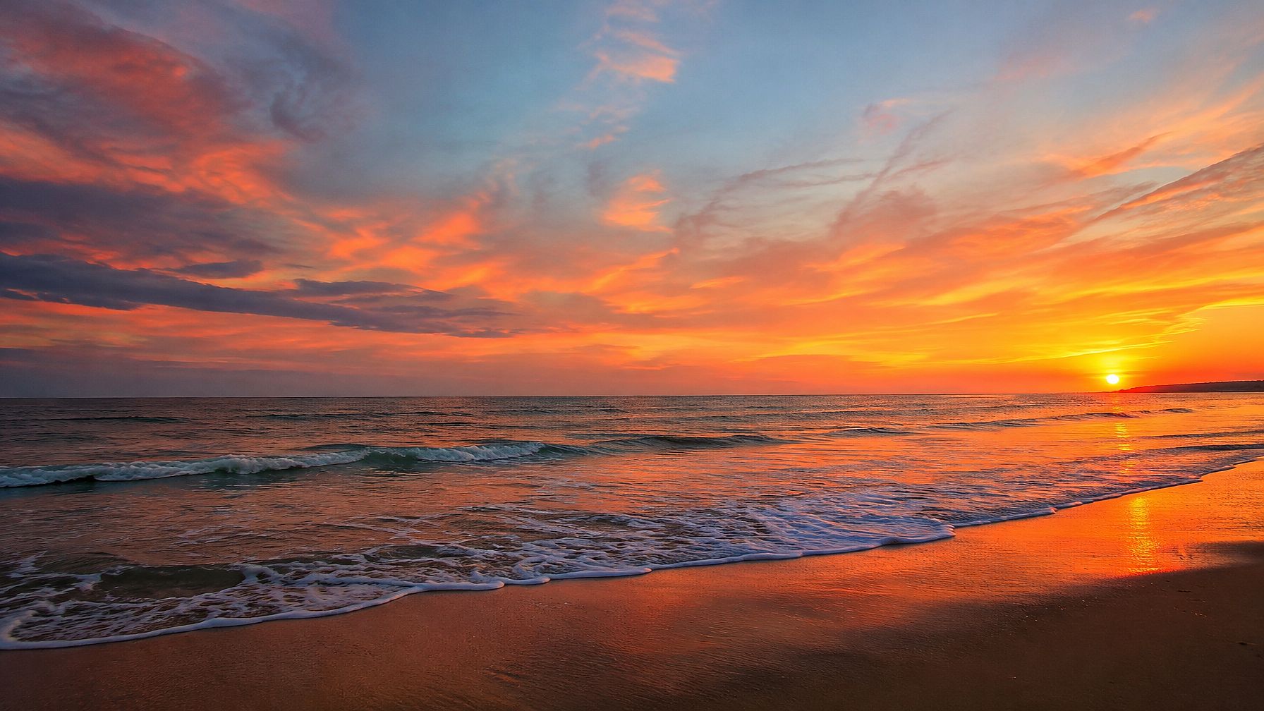
What this controls: The hand-drawn style sets a local, approachable feel. The central open area and reserved space for hours keep it functional.
What to change: Replace "farmers market" with your business type. Adjust border illustrations to match your products (bread for a bakery, books for a bookshop).
18. Yoga studio grand opening poster (serene)
A calm and inviting poster for a yoga studio grand opening, a single lotus flower illustration centered on a soft sage-green background, gentle watercolor texture, warm gold accents on the petals, open space above the lotus for the studio name and "Grand Opening" text, separate small area below for the address, first-class schedule, and introductory offer, serene and grounded design, vertical format, 2:3 aspect ratio
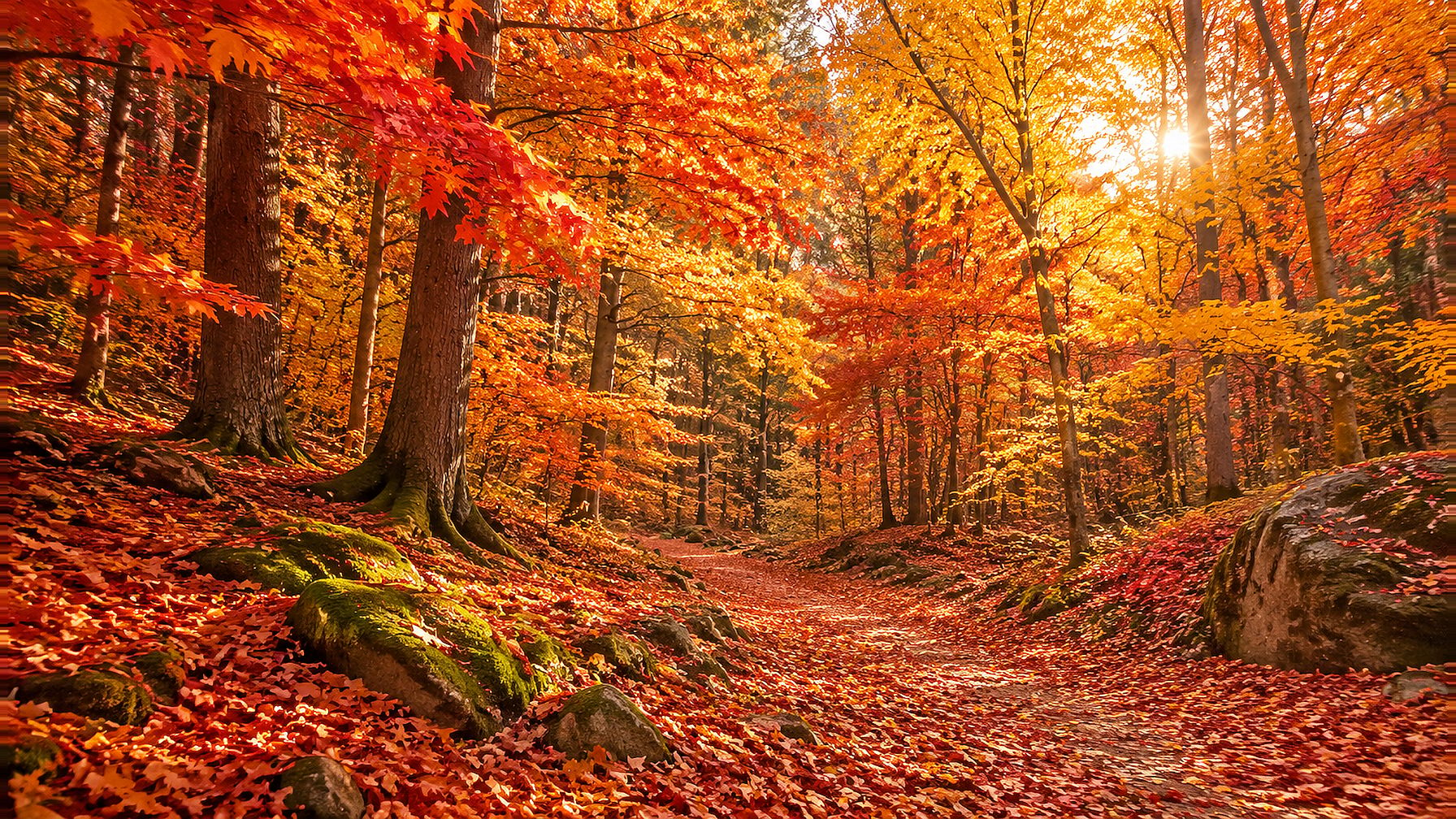
What this controls: The lotus sets a peaceful tone. The above/below text split separates the studio's identity (top) from practical details (bottom).
What to change: Swap the lotus for an icon that matches your studio (mountain silhouette, moon phase, figure in a pose). Adjust the background color to your brand palette.
19. Bookshop reading event poster (literary)
A cozy illustrated poster for an independent bookshop reading event, a stack of books with a warm reading lamp on a wooden table, soft amber lighting and muted earth tones, hand-drawn illustration style with fine ink lines, open space above the stack for the event title and featured author name, smaller reserved area at the bottom for the bookshop name, date, and time, intimate literary atmosphere, vertical format, 2:3 aspect ratio
What this controls: The book stack and lamp create a warm setting that signals "literary event" without showing a person.
What to change: Replace the reading lamp with a candle or coffee cup to shift the mood. Add your bookshop's signature detail (a cat, a window seat, a particular shelf color).
20. Pet grooming salon poster (playful)
A playful illustrated poster for a pet grooming salon, a cheerful cartoon dog sitting in a bathtub surrounded by soap bubbles, bright teal and warm coral palette, the dog and bathtub centered in the lower half, large open space in the upper half for the salon name, tagline, and phone number, secondary small strip at the bottom for the address and business hours, friendly cartoon illustration style with rounded shapes, vertical format, 2:3 aspect ratio
What this controls: The cartoon dog and bubbles make the poster approachable. The upper-half text zone is large enough for the salon name, a tagline, and the phone number.
What to change: Swap the dog for a cat, rabbit, or group of animals if your salon serves more than dogs. Replace teal and coral with your brand colors.
Midjourney poster prompts: what transfers and what does not
Many of the poster prompts above were originally built for Midjourney. If you are looking for a midjourney poster design workflow specifically, here is what to know.
Moving a Midjourney prompt to OpenArt
Midjourney uses parameter flags (--ar 2:3, --no text, --v 6.1, --style raw) that other models ignore. Strip those flags and use OpenArt's built-in controls for aspect ratio and model selection instead.
The descriptive part of a prompt (subject, style, color, composition) transfers directly.
OpenArt does not include the Midjourney model, so the visual output will differ depending on which model you choose. The layout and composition instructions carry over well.
For movie poster prompts, see the separate article. Film posters need character hierarchy, title treatment, and billing block space that event and marketing posters do not.
Style variations: same brief, different look
The best way to see how style changes poster prompts is to keep the brief identical and swap only the style direction.
21. Jazz concert, minimalist version
A vertical minimalist jazz concert poster for an evening performance, a single saxophone silhouette centered on a solid midnight navy background, one accent color (warm gold) used sparingly, generous white space at the top for the concert title, no decorative borders or ornamental elements, clean sans-serif typography area, portrait composition, 2:3 aspect ratio
Compare this to the Art Deco version (prompt 7). Same subject and palette, completely different poster.
22. Retail sale, neon pop version
A vibrant neon pop art retail sale poster, bold geometric shapes in hot pink, electric yellow, and black, oversized price tag illustration in the center, comic-book halftone dot pattern in the background, wide open banner across the top for the sale headline, smaller strip at the bottom for store details and dates, flat graphic pop art style inspired by 1960s advertising, vertical format, 2:3 aspect ratio
Same job as prompt 1 (retail sale), completely different energy. This is why poster design prompts benefit from style experiments.
23. Coffee launch, dark moody version
A dramatic dark-toned poster for a specialty coffee launch, a single ceramic coffee cup on a black slate surface, deep espresso-brown and charcoal palette with one streak of warm amber light, high-contrast chiaroscuro lighting, the cup small and centered in the lower third, expansive dark space in the upper two-thirds for the brand name in a light typeface, no additional props, cinematic product photography, vertical format, 2:3 aspect ratio
Compare this to the warm editorial version (prompt 13). The dark version suits a premium single-origin launch. The warm version suits a neighborhood cafe.
How to adapt a poster prompt for different formats
Start with a prompt that already works. Then change only the format-specific fields.
| Change needed | What to adjust |
|---|---|
| Vertical poster to square social post | Aspect ratio from 2:3 to 1:1. Headline area from top to center. Fewer elements, bolder focal point |
| Poster to wide banner | Aspect ratio to 16:9 or 3:1. Subject on one side, text area on the other |
| Print poster to digital screen | Remove paper texture references. Add screen-friendly terms (high saturation, backlit feel) |
Keep subject, palette, and style the same across formats so the campaign reads as one visual identity. For banner prompt examples, see the dedicated article.
How to keep text readable on an AI poster
AI models can generate words on an image, but every generated letter needs checking. Short, simple words work best.
A single headline of two or three words is far more reliable than a full sentence. These tips apply to every prompt in this guide, regardless of the model you choose.
How quotation marks work
Place the text you want inside double quotation marks within the prompt, for example: add with the exact headline "JAZZ NIGHT".
In OpenArt with a model like GPT Image 2.5, include text requests directly in your prompt. GPT Image 2.5 handles in-image text more accurately than most models.
Always check the generated spelling
Quotation marks get you close, but the model may still swap letters or skip characters with longer phrases. Before publishing, check every word.
Dates, prices, phone numbers, and calls to action should be added or corrected in a design tool afterward. Leave a blank headline area in your prompt if you plan to add longer text manually.
Reserve a zone for your logo
Add a reserved empty space to your prompt (for example, "small open square in the lower-right corner for a logo") and place the real logo there in your design tool. Your actual logo file gives you a sharper, more accurate result than any AI-generated version.
How to generate and refine a poster in OpenArt
OpenArt gives you a direct path from prompt to finished poster.
- Open AI Poster Maker and paste your prompt. Upload a reference image if you have a product or photo to include.
- Pick your model. GPT Image 2.5 is strong for posters with readable text. Set the aspect ratio and generate.
- Check every generated word. If the layout is right but one area needs changes, use Edit Image to fix that region without regenerating the whole poster.
24. Quick-start prompt for OpenArt
A professional [YOUR EVENT TYPE] poster, [YOUR MAIN SUBJECT] centered in the lower half, [YOUR TWO BRAND COLORS] palette, generous open space in the upper third for the event title and date, smaller reserved area at the bottom for location and contact details, [YOUR PREFERRED STYLE] design, vertical format, 2:3 aspect ratio
Replace the bracketed fields with your real details and paste into OpenArt.
25. Quick-start prompt for product posters
A clean [YOUR PRODUCT CATEGORY] advertising poster, one [YOUR PRODUCT DESCRIPTION] positioned in the lower-center third, [YOUR BRAND COLORS] palette, soft directional studio lighting, expansive negative space in the upper two-thirds for the product name and tagline, no additional props or decorative text, minimal editorial composition, vertical format, 2:3 aspect ratio
Before you print
A generated poster is a visual draft. Verify the pixel dimensions meet your printer's requirements, add final text in a design tool, and check margins and bleed (3-5 mm is typical). An aspect ratio in a prompt sets the shape of the image. Your printer controls the physical dimensions separately.
Free credits are available for new OpenArt accounts (40 trial credits). Check current pricing for plan details.
Frequently asked questions
How do I write a good prompt for poster design?
Name the poster's purpose (event, product ad, business promotion), the focal subject, where the headline and date should go, the color palette, and the aspect ratio. Layout instructions matter more than style words in poster prompts.
A prompt that says "bold Art Deco" without reserving headline space gives you art. It takes layout instructions to get a real poster.
What aspect ratio should I use for a poster?
Most vertical posters work well at 2:3, which matches standard print proportions. Use 9:16 for social stories, 1:1 for square social posts, and 16:9 for wide banners. Match the ratio to where the poster will appear.
Can I use Midjourney poster prompts in other AI tools?
Yes. Strip Midjourney-specific flags like --ar 2:3 and --no and use the new tool's built-in controls instead. The subject, style, color, and composition parts of your prompt work across models without changes.
How much text should I put in an AI poster prompt?
Keep generated text to two or three short words for accuracy. For anything longer or anything that must be exact (dates, prices, phone numbers), add the final copy in a design tool after generation.
Are AI-generated posters ready to print?
They are a strong starting point. Verify text accuracy, check resolution against your printer's specs, and add bleed margins if required. Treat the output as a visual draft you finish with your real headline, logo, and contact details.