The funny thing about AI images looking "obviously AI" in 2026 is that it's rarely about the technology failing anymore. The models can render a believable hand, legible text, and a photorealistic face without breaking a sweat. What gives an image away now isn't a glitch but a set of aesthetic defaults, the safe choices a model reaches for when nobody tells it otherwise. The tells below aren't limitations of the technology, they're habits, and every one of them is fixable.
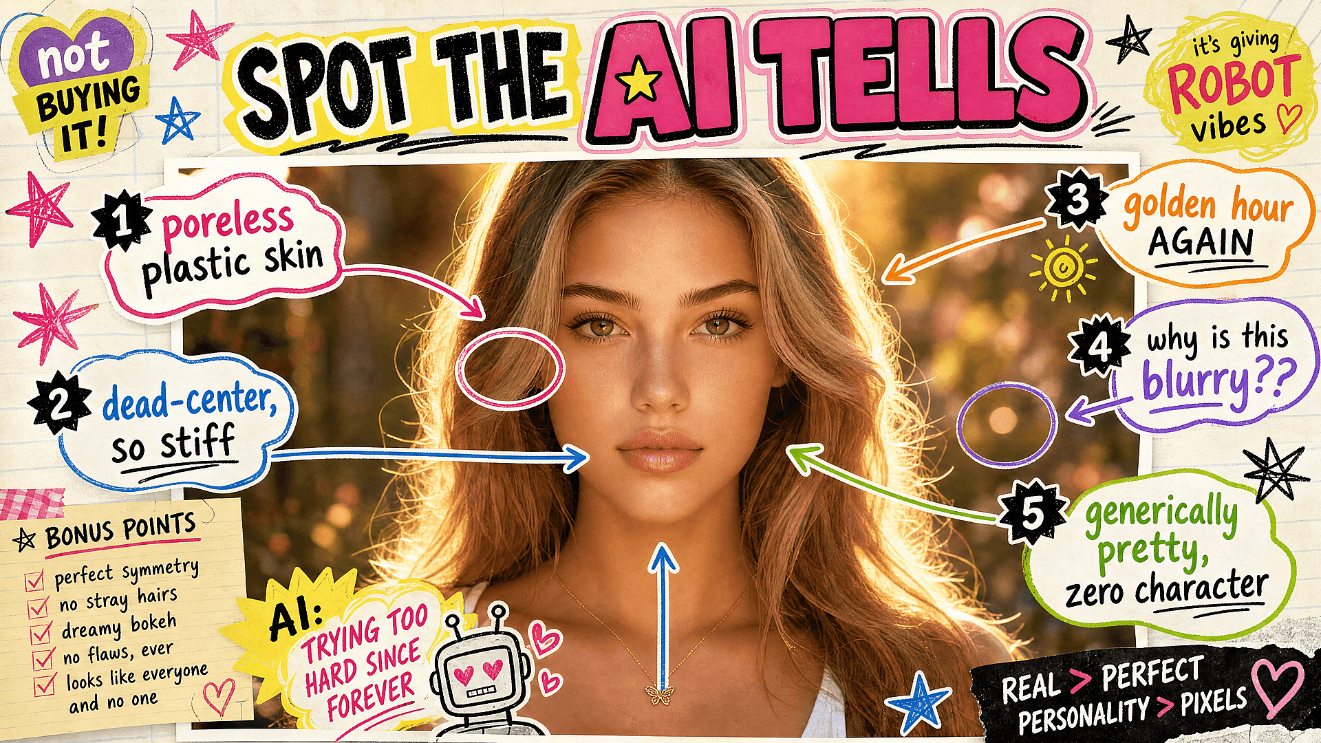
1. The plastic, poreless skin
You know it the second you see it: skin with the texture of a mannequin, every pore airbrushed away, a sheen that makes a human face look vacuum-sealed. It's the single most common giveaway, and it shows up because models trend toward an idealized smoothness unless you tell them otherwise. Real skin has texture, pores, faint redness, the small imperfections that read as alive.
The fix is to ask for them directly. Prompt for natural skin texture, visible pores, subtle imperfections, and unretouched detail, and if your tool supports it, dial back whatever skin-smoothing or beautification is running by default. A face that looks a little more lived-in reads as far more real than one polished to glass.
2. The everything-is-golden-hour lighting
At some point every AI image decided it was shot at 6:47pm on a warm evening in late summer. That warm, hazy, backlit glow gets applied to corporate headshots, product shots, indoor scenes, and overcast streets alike, whether or not the light makes any physical sense. It's pretty, which is exactly why it's become a cliché, and its overuse flattens every mood into the same nostalgic warmth.
The fix is to specify lighting that actually fits the scene. Flat overcast daylight, harsh midday sun, cool fluorescent office light, the blue cast of a screen in a dark room. Real photographs live in all kinds of light, much of it unflattering, and choosing the right one for your subject is what makes an image feel observed rather than generated.
3. The dead-center, perfectly symmetrical composition
A lot of AI images place the subject squarely in the middle of the frame, balanced, centered, and weirdly static. It's the visual equivalent of standing at attention. Human photographers and illustrators use the edges, the rule of thirds, negative space, and deliberate imbalance to create tension and movement, and the absence of all that is part of what makes an image feel machine-arranged.
The fix is to compose on purpose. Ask for off-center framing, for the subject placed to one side, for an interesting crop or an unexpected angle. Even describing a specific camera position, low and looking up, or shot from across the room, pushes the model out of its default head-on symmetry into something that feels like a choice.
4. The over-detailed everything
When a model has no guidance about where to focus, it tends to make everything equally ornate: intricate patterns on every surface, embellishments stacked on embellishments, a busy maximalism with no rest for the eye. The result looks impressive for a half-second and exhausting after that, because nothing is emphasized when everything is.
The fix is hierarchy. Decide what the image is actually about and let the rest recede. Prompt for simplicity in the background, a single focal point, clean negative space around the subject. Good images send the eye somewhere on purpose, while cluttered ones dump everything in your lap and leave you to sort it out.
5. The generically beautiful face
AI has a type, and you've met it a hundred times: symmetrical, ageless, conventionally attractive, with the faintly generic quality of a face averaged out of a thousand other faces. These people have no pores (see number one), no asymmetry, no character, and no apparent age between twenty-five and thirty-four. They are pleasant and instantly forgettable, and a scene full of them reads as synthetic no matter how clean the render is.
The fix is specificity and the courage to make a face interesting rather than perfect. Describe real, varied features: an asymmetrical smile, a prominent nose, freckles, wrinkles, a gap in the teeth, a face with some age and history in it. Specify ages and let people look their age. The faces that stop a scroll are almost never the most symmetrical ones.
6. The unmotivated background blur
Somewhere along the way, the models learned that shallow depth of field looks professional, and now everything gets the portrait-lens treatment: a creamy blurred background behind subjects that would never actually be shot that way. A wide landscape with a blurred horizon, a product photo where half the product is out of focus, a casual snapshot with cinema-grade bokeh. The blur is doing the work of looking expensive, and it gives the game away.
The fix is to treat depth of field as a decision rather than a default. Plenty of great images are sharp front to back, especially landscapes, product shots, and anything documentary. Ask for deep focus, everything in focus, or a specific aperture when blur isn't actually serving the image. Reserve the shallow look for when it genuinely belongs.
The thread running through all six is the same: these clichés are what a model gives you when you don't tell it otherwise, and overriding them is most of what separates work that looks generated from work that looks made. The tools will keep getting better at execution, but they'll keep defaulting to the safe, smooth, centered, glowing average unless a person with a point of view steps in and makes different choices. That part is still yours, and it's still the whole game.