
 ChatGPT
 Perplexity
 Claude
 Gemini
Los mejores generadores de imágenes con IA para diseñadores, probados en trabajos reales
El mejor generador de imágenes con IA para diseñadores no siempre es el que crea la imagen más bonita a la primera. Los diseñadores necesitan una herramienta capaz de seguir un layout, trabajar a partir de referencias, mantener un sistema visual coherente en toda una campaña y sobrevivir a varias rondas de ediciones. Esta guía compara las principales opciones por el trabajo que ocurre después de generar: dirección de arte, revisión, tipografía, redimensionado, revisión de derechos y entrega para producción.
Para la mayoría de flujos de diseño mixtos, Generador de imágenes con IA de OpenArt es nuestra mejor opción general. Reúne modelos de imagen líderes como GPT Image 2, Nano Banana 2 Lite, Seedream 5.0 Pro, y Grok Imagine en un solo espacio de trabajo y, después, te permite editar, ampliar, cambiar el estilo, eliminar fondos y mejorar la resolución del resultado elegido. Midjourney sigue siendo una gran opción para la exploración visual. Adobe Firefly encaja con equipos que ya trabajan en Creative Cloud. Ideogram resulta útil cuando el texto visible es central en la imagen.
Veredicto rápido
| Herramienta | Ideal para | Punto fuerte principal | Límite principal |
|---|---|---|---|
| OpenArt | El mejor en conjunto para flujos de trabajo de diseño con varios modelos | Varios modelos líderes más edición en una sola plataforma | La variedad de modelos requiere algo de pruebas |
| Adobe Firefly | Producción con Creative Cloud | Integración con el flujo de trabajo de Photoshop y Adobe | La mejor opción suele depender de tu configuración de Adobe y de tu plan de créditos |
| Midjourney | Dirección de arte y exploración visual | Estéticas distintivas y controles de estilo | El trabajo de producción final suele pasar a otra app de diseño |
| Ideogram | Pósters y conceptos centrados en el texto | Renderizado de texto potente y composiciones gráficas | Menos completo como espacio de diseño integral |
| Imágenes de ChatGPT | Briefs y revisiones conversacionales | Buen seguimiento de instrucciones y edición en lenguaje natural | Las ediciones basadas en selección pueden afectar a zonas más allá de la máscara |
| Canva AI | Diseños rápidos para redes y marketing | Los recursos visuales generados se colocan dentro de un editor de plantillas | Menos control para una dirección de arte detallada |
| Stable Diffusion | Flujos de trabajo personalizados y técnicos | Control avanzado y opciones de despliegue local o personalizado | La configuración, la elección de modelo y el control de calidad requieren más trabajo |
La mejor opción según la tarea de diseño
- Elige OpenArt cuando necesitas varios modelos de imagen, creación guiada por referencias, edición, cambio de estilo y escalado en un solo flujo de trabajo.
- Elegir Adobe Firefly cuando Photoshop y Creative Cloud ya son tu base de producción.
- Elige Midjourney cuando la exploración visual y la dirección estética importan más que el control del diseño final.
- Elige Ideogram cuando hace falta que aparezca texto dentro de conceptos de póster o packaging.
- Elige ChatGPT Images cuando los briefs y las revisiones son más fáciles de explicar hablando.
- Elige Canva AI cuándo se completará el recurso final dentro de una plantilla social o de marketing.
- Elige Stable Diffusion cuándo merece la pena la configuración y el mantenimiento de un pipeline técnico personalizado.
No hay un ganador universal para cada tarea de diseño. La mejor opción es la que produce una serie utilizable, acepta revisiones concretas y llega al diseño final con el menor trabajo de arreglo posible.
Por qué esta comparación importa ahora
La creación de imágenes con IA ha pasado de ser un experimento ocasional a formar parte del trabajo creativo diario, pero los diseñadores no se decantan por una única herramienta universal. Informe del Kit de herramientas para creadores 2026 de Adobe, publicado en junio de 2026, encuestó a más de 16.000 creadores en ocho países. Descubrió que el 87 % dice que la IA generativa ha acelerado el crecimiento de su negocio o audiencia, y el 75 % ya la considera integrada o esencial en su forma de trabajar. El mismo informe reveló que el 57 % afirma que sus resultados con IA suelen necesitar una edición moderada o extensa antes de estar listos para compartir.
Esa carencia en la edición es la verdadera razón por la que una comparativa centrada en diseñadores debe ir más allá de la calidad de generación en bruto. Una herramienta puede crear una primera imagen impresionante y, aun así, fallar en un flujo de trabajo profesional si es difícil de revisar, complicada de mantener acorde con la marca o poco clara para uso con clientes.
Informe de IA de Figma de 2026 aporta una perspectiva de diseño de producto, basada en tres años de datos y 8.403 respuestas de encuesta en diez mercados. Su conclusión más clara contradice la idea de que la IA reduce el papel del diseñador: el 90 % de los encuestados dice que el diseño es al menos tan importante como antes de la IA, y el 58 % afirma que es incluso más importante, una opinión que también comparte el 65 % de los desarrolladores. La pregunta útil ya no es si los diseñadores probarán la IA, sino dónde encaja en la investigación, la exploración, la producción y la revisión.
Qué deben buscar los diseñadores en un generador de imágenes con IA
Un generador de imágenes con IA para diseñadores gráficos debería reducir el tiempo de exploración sin eliminar las decisiones de diseño. El resultado sigue necesitando jerarquía, un punto focal aprovechable, espacio para el texto y suficiente control para admitir revisiones.
1. Control de composición
Los diseñadores rara vez necesitan «una imagen bonita» de forma aislada. Necesitan una imagen principal apaisada con espacio libre a la izquierda, un visual de producto cuadrado con el sujeto centrado o un recorte vertical capaz de sostener un titular. Los controles de relación de aspecto son útiles, pero las imágenes de referencia y las instrucciones espaciales claras importan más.
2. Resultados editables
El primer resultado es un punto de partida. Una herramienta útil debería permitirte eliminar un objeto, reemplazar un fondo, ampliar el lienzo, ajustar una parte de la escena o cambiar el estilo de la imagen manteniendo su estructura. Si cada cambio te obliga a empezar de cero, la herramienta genera más trabajo de revisión del que ahorra.
3. Renderizado de texto
El texto dentro de una imagen es clave para carteles, conceptos de packaging, portadas editoriales, señalización y gráficos para redes. Incluso los mejores modelos pueden cometer errores de ortografía o espaciado, así que los diseñadores deben tratar la tipografía generada como un borrador y revisar cada palabra antes de publicar.
4. Referencia y coherencia de marca
Un solo resultado impactante no es una campaña. Para el trabajo de marca, el generador debe responder a referencias de paleta, iluminación, forma del producto, identidad del personaje o estilo de ilustración. También debe facilitar la creación de varios recursos relacionados sin perder la dirección visual. Un Kit de marca facilita fijar esas referencias una sola vez y reutilizarlas en toda una campaña en lugar de rebriefar cada recurso desde cero.
5. Encaje en producción
La herramienta adecuada debería integrarse sin problemas con el resto de tu flujo de trabajo. Eso puede significar crear un concepto en OpenArt y rematar la tipografía en Figma, ampliar una fotografía en Photoshop o montar un diseño para redes en Canva. Valora todo el recorrido, desde el brief hasta la entrega, no solo la pantalla de generación.
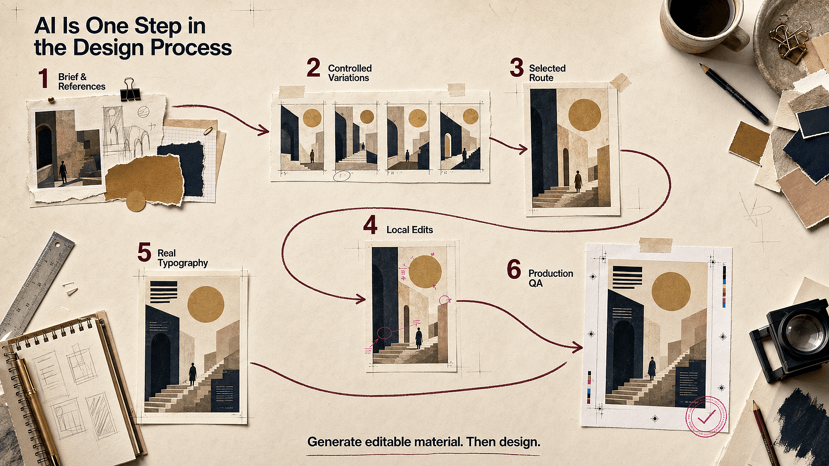
Nota sobre el flujo de trabajo: Brief y referencias → variaciones de imagen controladas → ruta seleccionada → ediciones locales → tipografía real → control de calidad de producción. El generador de imágenes debería aportar material visual editable. No debe tratarse como todo el proceso de diseño.
Seis problemas de diseño que las imágenes con IA aún no resuelven por sí solas
La preocupación recurrente en las conversaciones de diseñadores no es la falta de imágenes, sino la falta de control sobre la imagen como recurso de diseño. Estos seis problemas son donde un flujo de trabajo profesional demuestra su valor.
Problema 1: La imagen se ve bien, pero el diseño es inutilizable
Los modelos de IA suelen atraer al sujeto hacia el centro o llenar cada zona vacía con detalles. Eso funciona para una imagen independiente, pero no deja espacio para un titular, una CTA, la navegación o el mensaje del producto. Un plano hero centrado con un fondo recargado es inservible por muy buena que sea la iluminación, porque no queda sitio para el mensaje real del cliente.
Integra la zona segura para el texto en el propio brief en vez de arreglarlo después. Indica el lado y aproximadamente cuánto lienzo necesita, algo como «mantén el 40 % izquierdo visualmente tranquilo», y descarta objetos de alto contraste, caras o bordes marcados dentro de esa zona. Luego prueba la imagen con un titular real antes de dar el visto bueno a la composición, no con un texto de relleno.
En OpenArt, eso significa elegir un modelo que realmente siga las instrucciones espaciales y luego ampliar o reencuadrar la imagen seleccionada si la zona para el texto queda demasiado justa. Comparar dos o tres modelos con el mismo encargo es mejor que reescribirlo desde cero en suscripciones separadas.
Problema 2: cada imagen de la campaña parece no tener relación con las demás
Un prompt repetido no crea un sistema de diseño. El color, la iluminación, la altura de cámara, la escala del producto, los rasgos faciales y los detalles de la ilustración pueden variar de una generación a otra.
Directriz de diseño: crea una pequeña especificación visual antes de hacer la serie:
- De 3 a 5 colores de paleta fijos
- una dirección de iluminación y un nivel de contraste
- una regla de altura de cámara
- un vocabulario de materiales y texturas
- un conjunto de referencias para producto, personaje y entorno
- una lista de elementos que no deben cambiar
Bloquea la imagen aprobada como referencia para el siguiente recurso. Cambia la proporción del canal o la escena manteniendo estable la especificación visual.
Flujo de trabajo de OpenArt: mantén en un mismo espacio visual la creación guiada por referencias, la edición de imágenes y el trabajo con personajes. Esto resulta mucho más útil para una campaña que tratar cada resultado como una tirada de dados independiente.
Problema 3: una pequeña revisión destruye las partes ya aprobadas
Los diseñadores suelen necesitar un cambio puntual: mover un objeto, reducir un reflejo, cambiar el color de una pared o crear más espacio sobre un producto. Regenerar por completo puede alterar el sujeto, la cámara o el estilo que el cliente ya había aprobado.
Directriz de diseño: revisa de lo grande a lo pequeño. Primero fija la composición y el sujeto. Después corrige la precisión del producto o del personaje. Luego edita materiales, iluminación y detalles del fondo. No combines cinco cambios sin relación en una sola instrucción, porque resulta más difícil identificar qué causó un empeoramiento.
Flujo de trabajo de OpenArt: usa los controles de borrado, sustitución de fondo, expansión, cambio de estilo o imagen a imagen sobre el recurso elegido. Guarda puntos de control tras cada pasada aprobada.
Problema 4: El texto generado se acerca, pero no es publicable
El renderizado de texto ha mejorado mucho, sobre todo en los modelos pensados para recursos de diseño. Pero una sola letra mal puesta sigue inutilizando un póster o un envase, y una palabra visualmente convincente no es lo mismo que una tipografía editable. Una etiqueta de precio que pone «9,99 $» en la vista previa y «9,98 $» al ampliar no es un error de redondeo: es una reimpresión.
Trata el texto generado como material de exploración, no como el resultado final. Úsalo para dar textura, como arte visual integrado o para probar cómo queda un titular en la composición, y luego coloca los titulares reales, los precios, el texto legal, las fechas y las etiquetas de la interfaz con fuentes de verdad. La ortografía, el interletrado, el contraste, el orden de lectura y la localización necesitan cada uno su propia revisión, porque una revisión de diseño que solo mira la imagen entera suele pasar por alto justo este tipo de detalle.
GPT Image 2 u otro modelo adecuado puede acercarte bastante al concepto, pero para la tipografía final el diseño limpio aún hay que llevarlo a Figma, Photoshop o Illustrator. Aquí OpenArt es la capa de creación visual, no un sustituto del control tipográfico.
Problema 5: la imagen no sobrevive a una campaña multiformato
Una imagen cuadrada puede quedar mal al recortarla para un hero 16:9 o una story 9:16. Los sujetos se ven demasiado grandes, las manos o los productos se cortan y desaparece el espacio para el texto.
Directriz de diseño: planifica una composición maestra con tolerancia al recorte. Mantén los detalles críticos lejos de los bordes y crea suficiente entorno alrededor del sujeto. Pruébala al menos en 1:1, 16:9, 4:5 y 9:16 antes de aprobar la dirección visual.
Flujo de trabajo de OpenArt: crea o amplía proporciones alternativas a partir de la fuente seleccionada en lugar de estirar la misma imagen aplanada.
Punto débil 6: el equipo no sabe explicar de dónde salió la imagen
Los diseñadores que trabajan con clientes necesitan conocer el modelo, los recursos de origen, el historial de ediciones y las condiciones de uso. Es tanto un problema de proceso como legal.
Directriz de diseño: lleva un registro ligero de procedencia con el modelo, la fecha, el prompt o brief, las referencias subidas, el estado de los permisos y las ediciones humanas significativas. Evita usar activos de marca sin licencia, personajes con derechos de autor o el nombre de un artista vivo como atajo para la dirección artística.
El informe de enero de 2025 de la Oficina de Derechos de Autor de EE. UU. establece que el material generado puramente por IA no está protegido por derechos de autor en Estados Unidos, mientras que la expresión creada por humanos, la selección y disposición creativas y las modificaciones creativas sí pueden estarlo. También indica que solo escribir prompts no aporta suficiente control con la tecnología generalmente disponible en la actualidad. Esto no es asesoramiento legal, pero da a los equipos de diseño una razón práctica para documentar la dirección artística humana y el trabajo final de producción.
Los mejores generadores de imágenes con IA para distintos flujos de diseño
1. OpenArt: la mejor opción global para diseñadores que quieren elegir modelo y editar
OpenArt es la opción más completa cuando tu trabajo salta entre arte conceptual, imágenes de campaña, escenas de producto, ilustraciones y edición de imágenes. En lugar de encerrar al diseñador en un solo modelo, te da acceso a varios modelos de imagen actuales en la misma plataforma. Eso importa porque ningún modelo es el mejor en todas las tareas de diseño.
GPT Image 2 es una opción práctica para visuales con mucho texto, infografías, recursos diseñados y un seguimiento fiel de las instrucciones. Nano Banana 2 Lite funciona bien para ediciones en lenguaje natural y cambios guiados por referencias. Seedream 5.0 Pro se adapta a composiciones detalladas y briefs visuales precisos. Puedes probar una dirección con un modelo, elegir el mejor resultado y seguir perfeccionándolo sin rehacer el flujo de trabajo en otro sitio.
OpenArt también conecta la generación con tareas habituales de producción. Los diseñadores pueden borra o reemplaza elementos, amplía una composición, cambia el fondo, reestilizar una imagen, y mejorar la resolución el recurso seleccionado. Esto lo hace útil después de la fase de ideas, no solo durante ella.
Ideal para: exploración de campañas de marca, conceptos para redes, escenas de producto, visuales editoriales, proyectos con personajes protagonistas y diseñadores que quieren varios modelos con una sola suscripción.
Ten en cuenta: la elección del modelo afecta al resultado. Usa un pequeño brief de prueba para descubrir qué modelo maneja mejor tu sujeto, tipo o estilo de referencia antes de producir un set completo. Si estás comparando plataformas por precio y no por modelo, nuestro comparación de precios y coste por generación entre los mejores generadores de imagen, vídeo y audio con IA es el lugar más preciso para buscar.
2. Adobe Firefly: lo mejor para flujos de trabajo de Photoshop y Creative Cloud
Adobe Firefly tiene más sentido para diseñadores cuyos archivos de producción ya viven en Photoshop, Illustrator, Express u otras herramientas de Creative Cloud. Su valor no se limita a la creación de texto a imagen. El relleno generativo, la expansión generativa, los tableros y las herramientas de edición conectadas pueden encajar dentro de un proceso de producción ya establecido.
Firefly resulta especialmente útil cuando la imagen generada es solo una parte de un archivo de diseño más grande. Un diseñador puede extender una fotografía para un nuevo encuadre, eliminar un elemento no deseado, explorar un fondo y seguir trabajando con las máscaras, capas, tipografías y herramientas de color de siempre.
Adobe también posiciona sus propios modelos Firefly para uso creativo comercial. Aun así, los equipos deben confirmar el modelo utilizado, las condiciones del plan, la política del cliente y las reglas de uso actuales, sobre todo cuando Firefly da acceso a modelos de terceros.
Ideal para: Equipos centrados en Adobe, composición de fotos, redimensionado de campañas, ediciones de producción y flujos de trabajo empresariales.
Ten en cuenta: Firefly es una suite muy completa, así que el coste y el acceso dependen del plan, los créditos generativos y el modelo elegido.
3. Midjourney: la mejor para dirección de arte y exploración de alto impacto
Midjourney sigue siendo una de las herramientas más potentes para encontrar rápidamente un ambiente visual. Sus perfiles de Personalización y los Moodboards ayudan a los diseñadores a orientar la estética, mientras que los controles de estilo permiten explorar a lo grande. Si quieres crear ese tablero de referencias antes de abrir cualquier generador, el de OpenArt Creador de moodboards es una forma rápida de recopilar y organizar primero la dirección visual. El Editor web añade inpainting, panorámica, zoom, Smart Select, capas y Retexture.
Funciona bien al principio de un proyecto: estudios de arte clave, direcciones de moda, referencias cinematográficas, conceptos editoriales y style frames. Cuando el resultado final necesita tipografía exacta, componentes reutilizables o detalles de producto muy controlados, los diseñadores suelen rematar el trabajo en una app de diseño convencional.
Ideal para: desarrollo de mood, territorios visuales, key art, imágenes editoriales y exploración estética.
Ten en cuenta: La documentación actual del Editor de Midjourney señala que sus últimas imágenes generadas pueden entrar en el Editor mientras algunas funciones de edición usan una versión anterior del modelo. Comprueba el flujo de trabajo actual antes de confiar en una coherencia exacta entre pasos.
4. Ideogram: lo mejor para pósteres centrados en el texto y conceptos gráficos
Ideogram merece un lugar en la lista de un diseñador cuando las palabras deben aparecer dentro de la imagen. Es útil para conceptos de pósteres, tratamientos de títulos, estudios de packaging, carteles, pegatinas y gráficos sociales donde la tipografía y la imagen deben sentirse como una sola composición.
Sus herramientas de Lienzo incluyen Relleno mágico y Extender, así que el flujo de trabajo puede ir más allá de una sola generación. Aun así, el texto generado no debería sustituir a la composición tipográfica final. Revisa la ortografía, el interletrado, las fuentes de marca, la accesibilidad y el texto legal en tu herramienta de maquetación antes de la entrega.
Ideal para: exploración de pósteres, tipografía decorativa, conceptos de packaging, tarjetas de título y gráficos sociales centrados en el texto.
Ten en cuenta: una buena representación de texto no es lo mismo que un sistema tipográfico listo para producción. Usa el texto generado como material visual y luego reconstruye los mensajes importantes con tipografía real.
5. ChatGPT Images: lo mejor para briefs conversacionales y cambios iterativos
ChatGPT Images funciona bien cuando un briefing de diseño es más fácil de explicar como una conversación. Puedes crear una imagen, subir un recurso existente, pedir un cambio, añadir texto, solicitar un fondo transparente o ajustar la relación de aspecto.
Esto resulta útil con las personas que dan feedback en lenguaje natural: «mantén el producto y la iluminación, quita las flores y deja más espacio por encima del sujeto». El editor oficial admite cambios en zonas seleccionadas, pero OpenAI advierte de que las ediciones pueden extenderse más allá de la región resaltada. Los diseñadores deberían comparar las revisiones con cuidado cuando la forma del producto o los detalles de marca deban permanecer exactos.
Ideal para: traducir un briefing escrito en imágenes, cambios iterativos de concepto, recursos transparentes y revisiones rápidas guiadas por las partes interesadas.
Ten en cuenta: el control conversacional es potente, pero no es un archivo de producción basado en capas.
6. Canva AI: lo mejor para diseños de marketing y redes sociales rápidos
Canva encaja bien cuando el resultado final es una publicación para redes, un gráfico para presentaciones, un folleto o un recurso de marketing creado a partir de plantillas. Magic Media puede crear las imágenes de origen, mientras que las herramientas de maquetación, marca y publicación de Canva se encargan del resto del recurso.
La principal ventaja es la rapidez para pasar de la imagen a la maquetación final. Es menos adecuada para diseñadores que necesitan una construcción de imagen profunda, máscaras precisas, composición compleja o un pipeline de producción muy personalizado.
Ideal para: equipos de redes sociales, variaciones rápidas de campañas, recursos para presentaciones y producción basada en plantillas.
Ten en cuenta: la comodidad puede hacer que los resultados parezcan genéricos. Sustituye las maquetaciones por defecto, ajusta el espaciado y aplica un sistema de marca claro.
7. Stable Diffusion: la mejor para control personalizado y técnico
Stable Diffusion no es una experiencia de producto fija. Es una familia de modelos que se usa a través de interfaces locales, servicios alojados, flujos de trabajo personalizados y herramientas especializadas. Para diseñadores o estudios con confianza técnica, esa flexibilidad puede dar cabida a modelos personalizados, canales repetibles, control preciso e infraestructura privada.
La contrapartida es el trabajo operativo. Elegir checkpoints, complementos, interfaces, hardware y ajustes puede convertirse en una disciplina aparte. Es una opción potente cuando la personalización es el requisito, pero no la vía más rápida para todos los equipos de diseño.
Ideal para: pipelines personalizados, equipos de arte técnico, flujos de trabajo locales y control especializado de estilo.
Ten en cuenta: la licencia y el uso permitido pueden variar según el modelo, el checkpoint o el servicio. Revisa los términos exactos asociados a lo que utilices.
Cómo comparar generadores de imágenes con IA como un diseñador
La mayoría de las comparativas públicas premian el mejor resultado individual. Eso no basta para el trabajo de diseño. Usa los siguientes criterios para comparar herramientas según lo que ocurre después de que aparece la primera imagen:
- Fidelidad al brief: ¿Puede la herramienta respetar el sujeto, el escenario, la jerarquía, el encuadre, la paleta y las restricciones negativas?
- Control de referencia: ¿Puede un diseñador guiar la composición, el estilo, la identidad o la apariencia de un producto con entradas visuales?
- Calidad de revisión: ¿Puede cambiar una parte sin destruir el resto?
- Idoneidad para diseño gráfico: ¿Gestiona bien el texto, el espacio negativo, la consistencia entre series, los recursos transparentes y las proporciones más comunes?
- Continuidad del flujo de trabajo: ¿Puede el resultado integrarse en un diseño, campaña o pipeline de contenido real?
- Claridad comercial: ¿La identidad del modelo y los términos de uso son lo bastante claros como para que un equipo los revise?
No clasifiques las herramientas por un único ejemplo viral. Los modelos de imagen cambian rápido y los resultados varían según el encargo. La prueba útil es un pequeño sistema de diseño: una imagen principal, un recorte cuadrado, un recurso centrado en texto y una revisión a partir de la misma dirección visual.
Una prueba repetible de cuatro recursos
Usa la misma configuración de modelo, el mismo conjunto de referencias y el mismo brief siempre que las herramientas lo permitan. Anota el modelo y la fecha de la prueba, porque las funciones de los productos cambian.
- Crea una imagen destacada de campaña en 16:9. Requiere una posición fija del sujeto y al menos un 40 % de espacio libre para el texto.
- Crea un recurso complementario en formato 1:1. Mantén la paleta, la iluminación, la identidad del sujeto y el lenguaje de materiales de la imagen principal.
- Crea un concepto centrado en el texto. Usa una frase corta y fácil de comprobar, y revisa la ortografía, la jerarquía y la integración con la imagen.
- Solicita una única revisión concreta. Cambia el color de fondo o elimina un elemento manteniendo el sujeto, el encuadre, el estilo y la iluminación.
Puntúa cada herramienta de 1 a 5 en fidelidad al brief, fidelidad a la referencia, contención de la edición, consistencia de serie, precisión del texto y tiempo hasta un recurso final utilizable. La idea no es crear un benchmark universal. Es revelar qué herramienta genera menos trabajo de reparación para tu práctica de diseño.
| Área de pruebas | Qué revisar | Señal de fallo |
|---|---|---|
| Cumplimiento del brief | Posición del sujeto, recorte, paleta, exclusiones | Imagen atractiva que ignora la composición |
| Fidelidad de referencia | Detalles de producto, rostro, estilo y material | La dirección varía entre recursos |
| Editar contención | Las áreas aprobadas se mantienen sin cambios | Una pequeña edición reconstruye toda la imagen |
| Consistencia de la serie | Los recursos parecen de una misma campaña | Cada imagen tiene un lenguaje visual distinto |
| Precisión del texto | Ortografía, orden y legibilidad | Rótulos con buena pinta pero inservibles |
| Esfuerzo de producción | Pasadas de tiempo y reparación antes de la composición | Generación rápida seguida de una limpieza intensa |
Un mejor flujo de trabajo con imágenes de IA para diseñadores gráficos
Paso 1: Escribe un brief de diseño, no un montón de palabras sobre estilo
Define el recurso, el público, el mensaje, el sujeto, la jerarquía visual, la composición, la paleta, el material, la iluminación y la proporción de entrega. Indica qué debe quedar vacío para el texto. Añade una o dos referencias cuando importe la precisión visual.
Paso 2: Explora direcciones antes de pulir
Crea varias rutas realmente distintas, no veinte casi idénticas. Compara primero la composición y la idea. Los pequeños errores de textura son más fáciles de corregir que un concepto flojo.
Paso 3: Refina la ruta seleccionada por pasadas
Fija las grandes decisiones y luego edita un problema cada vez. Ajusta el sujeto y la composición antes que el detalle de la superficie. Añade la tipografía final, los logos, el texto regulado y los ajustes a nivel de píxel en tu herramienta de diseño habitual.
Crea y perfecciona un concepto de diseño en OpenArt
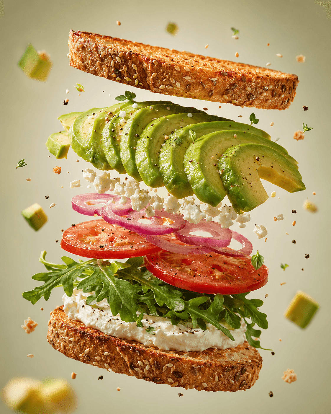
Ejemplos de referencia para conceptos de diseño gastronómico
[PRODUCT], vista explosionada en el aire, con [INGREDIENTS] flotando a su alrededor, fondo de estudio [BACKGROUND] limpio, fotografía comercial de alimentos, iluminación direccional suave, poca profundidad de campo, texturas ultradetalladas, fotorrealista, sin texto, sin logo.
Por qué funciona: el prompt describe la función del recurso, el diseño, el área de texto vacía, la posición del sujeto, el sistema visual y las exclusiones. Para crear una segunda ruta de campaña, cambia solo la dirección de arte y el set, manteniendo fijas las reglas de composición.
Consejo de experto: el mejor resultado es el que puedes dirigir artísticamente
Al valorar herramientas de IA, los diseñadores suelen fijarse en la calidad bruta de la imagen. En el trabajo con clientes, el coste de las revisiones suele ser la prueba más reveladora. Un resultado precioso que no puede conservar el producto, la composición o el personaje tras el feedback es menos útil que una imagen algo menos espectacular pero que sí se puede dirigir.
Los debates en la comunidad de diseñadores gráficos también revelan una división recurrente: los clientes pueden llegar con un concepto de IA sin pulir, pero siguen necesitando a un diseñador que resuelva la tipografía, la maquetación, los detalles de impresión, la coherencia de marca y la calidad de producción. Eso hace que la generación de imágenes con IA sea más útil como material dentro de un proceso de diseño, no como sustituto del proceso.
Lo que de verdad preocupa a los diseñadores en Reddit
Los debates en Reddit son anecdóticos, así que no deben tomarse como una encuesta representativa. Aun así, son útiles porque revelan el lenguaje y las situaciones que las páginas de producto pulidas suelen omitir.
"El cliente hizo algo con IA y ahora quiere que lo pulamos"
Un debate de r/graphic_design de 2026, más tarde cubierto por Creative Bloq, describía a diseñadores que recibían trabajos de clientes cuyos logotipos o gráficos para redes hechos con IA no daban la talla para el uso final. Las respuestas se centraban en los detalles que aún requerían trabajo de diseño profesional: preparación para impresión, maquetación, tipografía precisa y revisiones controladas.
Lo que el artículo debe responder: una imagen de IA es material de partida, no un sistema de identidad automático. El diseñador debe reconstruir los logos como vectores, sustituir la tipografía generada, definir reglas de espaciado y comprobar que la idea funciona a tamaños pequeños y en un solo color.
Cómo ayuda OpenArt: acorta la exploración visual y la revisión de imágenes, dejando al diseñador al mando del sistema de identidad y del archivo final.
«Consigo una buena imagen y la pierdo en cuanto pido un cambio»
En las conversaciones sobre arte con IA y Midjourney, los usuarios preguntan una y otra vez cómo mantener consistente un sujeto, una cara o un estilo a lo largo de las ediciones. Este es el coste práctico del "genera y cruza los dedos": un buen resultado puede no ser reutilizable.
Lo que el artículo debe responder: guarda los estados aprobados, edita una variable cada vez y usa flujos de trabajo guiados por referencia o de edición local. Para personas o mascotas recurrentes, define la identidad por separado de la pose, la ropa y el entorno.
Cómo ayuda OpenArt: los diseñadores pueden elegir entre modelos y usar edición, imágenes de referencia y Creador de personajes flujos de trabajo sin tratar cada imagen como un proyecto nuevo.
«¿Por qué herramienta debería pagar?»
Los hilos sobre elección de herramientas suelen acabar en debates sobre modelos, pero los diseñadores normalmente necesitan varias capacidades distintas: ideación, texto preciso, ediciones con referencia, escalado, trabajo de fondos y ratios alternativos. Esa es una de las razones por las que la encuesta de Adobe de 2026 reveló que el 58% de los creadores se sienten más capaces de competir con equipos más grandes desde que adoptaron la IA creativa: la ventaja viene de combinar capacidades, no de apostarlo todo a un solo modelo.
Lo que el artículo debe responder: prueba una minicampaña real, no un solo prompt. Mide los resultados aprovechables, el número de pasadas de corrección, la coherencia del conjunto y el tiempo hasta el diseño final.
Cómo ayuda OpenArt: su principal ventaja es la variedad de flujos de trabajo y el acceso a modelos en un solo lugar. El valor no está en afirmar que un modelo gana en todas las tareas.
«¿Puedo usar esto con seguridad para un cliente?»
Las preguntas de Reddit sobre uso comercial suelen mezclar el permiso de la plataforma, la propiedad de los derechos de autor, el riesgo de marca registrada, los derechos de la imagen de referencia y la política del cliente. Son comprobaciones distintas.
Lo que el artículo debe responder: verifica las condiciones exactas del modelo, conserva los registros de permiso de las entradas, evita la imitación engañosa, documenta los cambios humanos y aplica las reglas de aprobación del cliente. El permiso de uso comercial no garantiza que un resultado sea susceptible de derechos de autor ni que esté libre de derechos de terceros.
Cómo ayuda OpenArt: la elección del modelo y la edición pueden permanecer visibles en un solo flujo de trabajo, pero el diseñador y el cliente siguen teniendo el control del proceso de aprobación.
Una checklist práctica de control de calidad de diseño antes de entregar
Usa esta lista de comprobación después de seleccionar la imagen y antes de la exportación final:
Composición
- ¿El punto focal refuerza el mensaje?
- ¿Hay suficiente espacio libre para el texto real?
- ¿Sigue funcionando la maquetación con el recorte previsto?
- ¿El peso visual y el orden de lectura son intencionados?
Coherencia de marca
- ¿Coinciden la paleta, la iluminación, la textura y las reglas de cámara con la dirección aprobada?
- ¿Son precisas las formas del producto, el personaje y el logotipo?
- ¿Pertenece este recurso a la misma campaña que los demás?
Tipografía e información
- ¿Se ha reemplazado o revisado todo el texto generado importante?
- ¿Son legibles la jerarquía, el contraste, la longitud de línea y el espaciado?
- ¿Son correctas las fechas, los precios, las afirmaciones y las líneas legales?
Integridad de la imagen
- Revisa manos, reflejos, bordes, sombras, objetos repetidos y la geometría del fondo.
- Visualiza la imagen al 100 % y al tamaño final de visualización.
- Elimina los artefactos visuales que se hacen evidentes tras el escalado.
Derechos y entrega
- Registra el modelo y las referencias de origen.
- Confirma los permisos de los recursos subidos.
- Mantén el diseño editable y una exportación limpia solo de imagen.
- Documenta la selección, la disposición y las modificaciones humanas sustanciales cuando proceda.
¿Qué generador de imágenes con IA es el mejor para tu flujo de trabajo de diseño?
Elige OpenArt si quieres varios de los mejores modelos junto con herramientas de edición en un solo lugar. Elige Adobe Firefly si Photoshop y Creative Cloud ya son el centro de tu producción. Elige Midjourney para una exploración visual de gran impacto. Elige Ideogram cuando las palabras integradas o los tratamientos de título impulsan el concepto. Elige Canva para una entrega rápida basada en plantillas. Elige Stable Diffusion cuando merece la pena la configuración para tener control técnico personalizado.
Si tienes dudas, prueba el mismo encargo real en dos herramientas. Incluye una referencia, un recorte obligatorio, espacio negativo visible, una petición de edición y un segundo recurso en la misma línea. La ganadora es la herramienta que completa toda la secuencia con menos retoques.
Preguntas frecuentes
¿Cuál es el mejor generador de imágenes con IA para diseñadores en 2026?
OpenArt es la mejor opción global para diseñadores que quieren acceder a varios de los mejores modelos de imagen y herramientas de edición en un mismo flujo de trabajo. Adobe Firefly encaja mejor para producción centrada en Adobe, mientras que Midjourney destaca especialmente en la exploración visual e Ideogram en conceptos basados en texto.
¿Cuál es el mejor generador de imágenes con IA para diseñadores gráficos?
La mejor opción depende de la tarea. Para el trabajo de diseño gráfico amplio, busca control de referencias, composición con espacio negativo, edición selectiva, gestión de texto y una entrega limpia a Figma, Photoshop o Illustrator. OpenArt cubre la mayor variedad de modelos de generación y tareas de edición de imágenes en una sola plataforma.
¿Pueden los generadores de imágenes con IA crear diseño gráfico listo para producción?
Pueden crear buenas imágenes de origen y primeras direcciones de diseño, pero la mayoría de los recursos finales aún necesitan la revisión de un diseñador. Rehaz la tipografía importante, comprueba los logotipos y los detalles del producto, confirma el tamaño de salida y las necesidades de color, y revisa todo el texto legal o regulado.
¿Qué generador de imágenes con IA es mejor para el texto en imágenes?
Los modelos Ideogram y GPT Image son buenas opciones para conceptos de imagen basados en texto. Aun así, los resultados requieren corrección y una composición tipográfica profesional cuando las palabras conllevan requisitos de marca, legales o de accesibilidad.
¿Qué es mejor para diseñadores, Midjourney u OpenArt?
Midjourney es un gran especialista en estética, moodboards y exploración visual. OpenArt es más flexible para diseñadores que quieren comparar varios modelos y seguir con la edición, el cambio de fondos, el reestilizado y el escalado en la misma plataforma.
¿Es Adobe Firefly seguro para el trabajo de diseño comercial?
Adobe presenta los resultados de sus propios modelos Firefly como seguros para uso comercial, pero los diseñadores deben verificar el modelo exacto, los términos actuales, los requisitos del cliente y las condiciones del plan. Los modelos de terceros a los que se accede a través de una plataforma pueden tener términos diferentes.
¿Puedo usar imágenes generadas por IA en proyectos para clientes?
A menudo sí, pero el permiso no es universal. Revisa los términos de la herramienta y el modelo, la política de tu cliente, los derechos de cualquier referencia que hayas subido y las normas de tu mercado. No des por hecho que tener acceso a una herramienta garantiza protección de derechos de autor o libre uso de marcas.
¿Cómo consiguen los diseñadores que los visuales generados con IA sean coherentes?
Usa el mismo conjunto de referencias, modelo, paleta, reglas de iluminación, sistema de composición y restricciones negativas. Guarda los resultados aprobados como referencias para futuros recursos. Cambia una variable cada vez y mantén la tipografía y la maquetación finales en un archivo de diseño controlado.