
 ChatGPT
 Perplexity
 Claude
 Gemini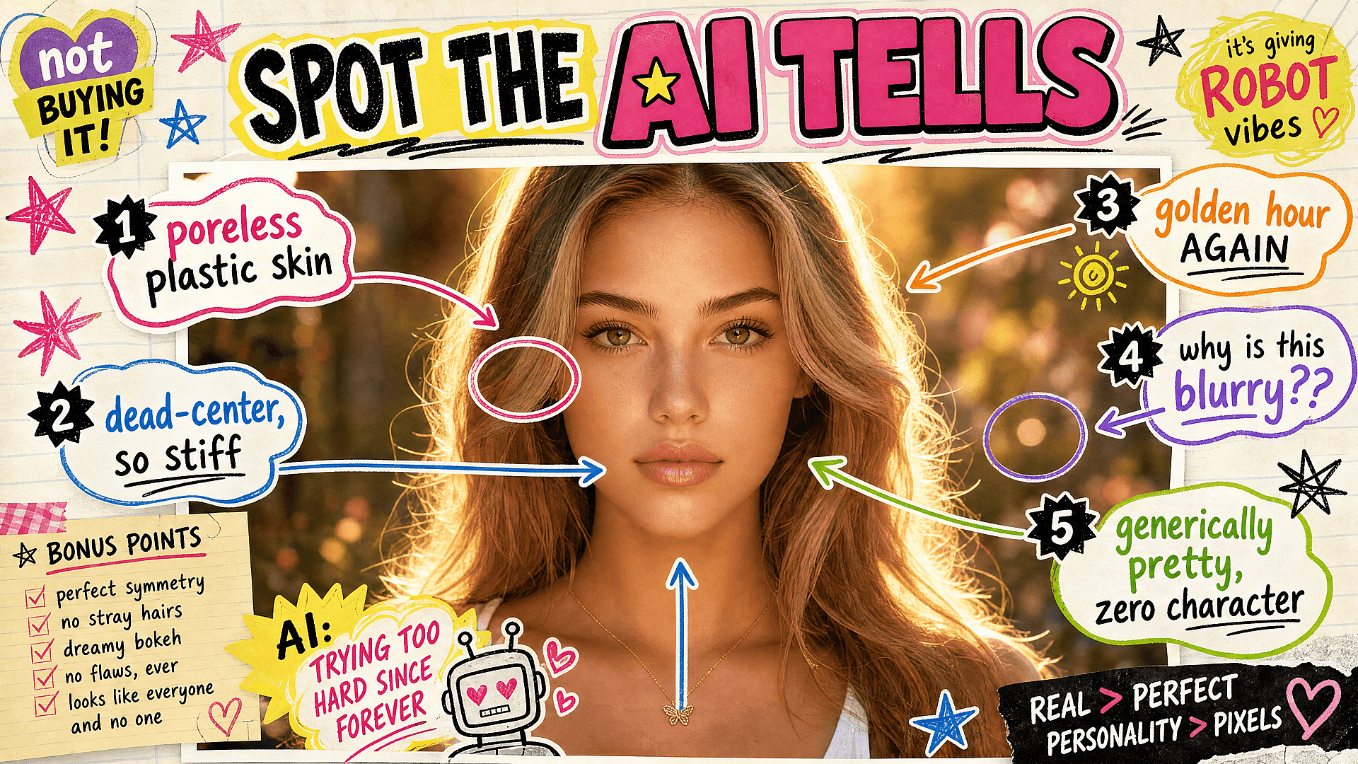
Lo curioso de que las imágenes con IA parezcan «obviamente de IA» en 2026 es que ya casi nunca se debe a fallos de la tecnología. Los modelos pueden renderizar una mano creíble, texto legible y un rostro fotorrealista sin despeinarse. Lo que las delata ahora no es un fallo, sino un conjunto de opciones estéticas por defecto: las decisiones seguras a las que recurre un modelo cuando nadie le indica lo contrario. Las pistas que verás abajo no son limitaciones de la tecnología, son hábitos, y todos ellos tienen solución.
1. La piel plástica y sin poros
Lo sabes en cuanto lo ves: piel con textura de maniquí, cada poro borrado con aerógrafo, un brillo que hace que un rostro humano parezca envasado al vacío. Es la señal delatora más habitual, y aparece porque los modelos tienden a una suavidad idealizada a menos que les indiques lo contrario. La piel real tiene textura, poros, un ligero enrojecimiento, esas pequeñas imperfecciones que la hacen parecer viva.
La solución es pedirlos directamente. Prompt para textura de piel natural, poros visibles, imperfecciones sutiles y detalle sin retoques y, si tu herramienta lo permite, reduce el suavizado de piel o la belleza que se aplica por defecto. Una cara con un poco más de vida se percibe mucho más real que una pulida hasta parecer cristal.
2. La iluminación de hora dorada permanente
En algún momento, toda imagen de IA decidió que se había tomado a las 6:47 de la tarde de una cálida noche de finales de verano. Ese resplandor cálido, brumoso y a contraluz se aplica por igual a retratos corporativos, fotos de producto, escenas de interior y calles nubladas, tenga sentido físico la luz o no. Es bonito, y precisamente por eso se ha convertido en un cliché: su uso excesivo aplana cualquier ambiente en la misma calidez nostálgica.
La solución es especificar una iluminación que encaje de verdad con la escena. Luz de día nublado y plana, sol duro de mediodía, luz fría de fluorescente de oficina, el tono azulado de una pantalla en una habitación a oscuras. Las fotografías reales conviven con todo tipo de luz, gran parte de ella poco favorecedora, y elegir la adecuada para tu sujeto es lo que hace que una imagen parezca observada en lugar de generada.
3. La composición centrada al milímetro y perfectamente simétrica
Muchas imágenes de IA colocan el sujeto justo en el centro del encuadre, equilibrado, centrado y extrañamente estático. Es el equivalente visual a estar firmes. Los fotógrafos e ilustradores humanos usan los bordes, la regla de los tercios, el espacio negativo y un desequilibrio deliberado para crear tensión y movimiento, y la ausencia de todo eso es parte de lo que hace que una imagen parezca ordenada por una máquina.
La solución es componer con intención. Pide un encuadre descentrado, el sujeto colocado a un lado, un recorte interesante o un ángulo inesperado. Incluso describir una posición de cámara concreta, baja mirando hacia arriba o desde el otro lado de la habitación, saca al modelo de su simetría frontal por defecto y lo lleva hacia algo que parece una decisión.
4. El exceso de detalle en todo
Cuando un modelo no tiene indicaciones sobre dónde centrar la atención, tiende a hacerlo todo igual de recargado: patrones intrincados en cada superficie, adornos sobre adornos, un maximalismo saturado que no da descanso a la vista. El resultado parece impresionante durante medio segundo y agotador a partir de ahí, porque cuando todo se enfatiza, nada destaca.
La solución es la jerarquía. Decide de qué trata realmente la imagen y deja que lo demás pase a un segundo plano. Pide un fondo sencillo, un único punto focal y espacio negativo limpio alrededor del sujeto. Las buenas imágenes dirigen la mirada a algún sitio con intención, mientras que las recargadas te lo sueltan todo de golpe y te dejan a ti la tarea de ordenarlo.
5. El rostro genéricamente bello
La IA tiene un tipo, y ya lo has visto cien veces: simétrico, sin edad, convencionalmente atractivo, con esa cualidad vagamente genérica de una cara promediada a partir de mil otras. Estas personas no tienen poros (ver el punto uno), ni asimetría, ni carácter, ni una edad aparente entre los veinticinco y los treinta y cuatro. Son agradables e instantáneamente olvidables, y una escena llena de ellas se percibe como sintética por muy limpio que sea el render.
La solución es la especificidad y el valor de hacer una cara interesante en lugar de perfecta. Describe rasgos reales y variados: una sonrisa asimétrica, una nariz prominente, pecas, arrugas, un hueco entre los dientes, una cara con algo de edad e historia. Especifica edades y deja que la gente aparente su edad. Las caras que detienen el scroll casi nunca son las más simétricas.
6. El desenfoque de fondo sin motivo
En algún momento, los modelos aprendieron que la profundidad de campo reducida queda profesional, y ahora todo recibe el tratamiento de lente de retrato: un fondo desenfocado y cremoso detrás de sujetos que nunca se fotografiarían así en realidad. Un paisaje amplio con el horizonte desenfocado, una foto de producto donde la mitad está fuera de foco, una instantánea informal con bokeh de nivel cinematográfico. El desenfoque hace que todo parezca caro, y ahí es donde se nota el truco.
La solución es tratar la profundidad de campo como una decisión y no como algo predeterminado. Muchas imágenes geniales están nítidas de principio a fin, sobre todo los paisajes, las fotos de producto y todo lo documental. Pide enfoque profundo, todo enfocado o una apertura concreta cuando el desenfoque no aporte nada a la imagen. Reserva el aspecto de poca profundidad para cuando de verdad encaje.
El hilo que recorre las seis es el mismo: estos clichés son lo que un modelo te da cuando no le indicas otra cosa, y sortearlos es lo que separa el trabajo que parece generado del que parece hecho. Las herramientas seguirán mejorando en la ejecución, pero seguirán recurriendo por defecto a la media segura, suave, centrada y luminosa, salvo que intervenga una persona con un punto de vista y tome decisiones distintas. Esa parte sigue siendo tuya, y sigue siendo lo que lo cambia todo.