Create Story


AI Tools
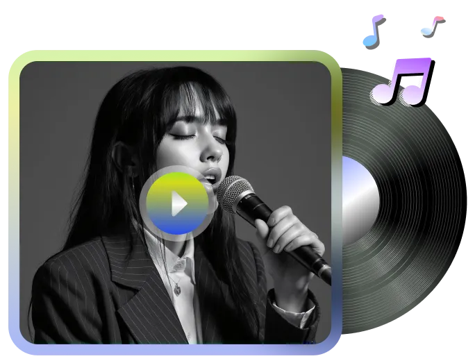
Lip-Sync Video
NewMake any video, image, or character talk.
Motion-Sync Video
NewTurn any video, image, or character into a motion-driven animation.

Video Upscale
Enhance resolution and frame rate in one click
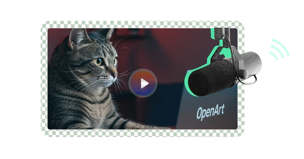
Chat to Edit
Start editing with a simple chat
Edit Image
Smart tools for image editing
Image Upscale
Upscale your images
Train a Character
Customize your creativity
Train a Model
See 100+ Fine-tuned models
Image to Prompt
Convert image to text prompt
Latest AI Models
Community
All
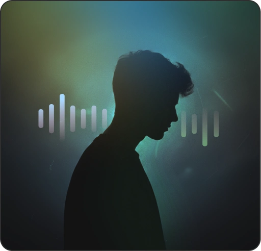
Music video
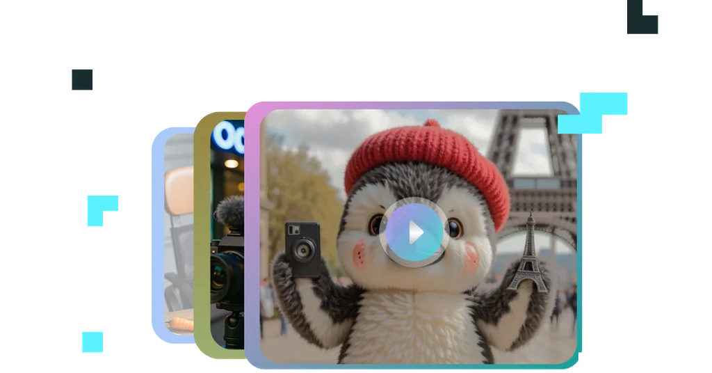
Character vlog
Explainer video
ASMR video
Create from scratch