OpenArt Logo
Sign in

matias Ogorinsky

matias Ogorinsky

Prompt

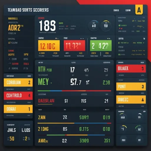
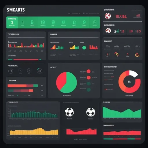
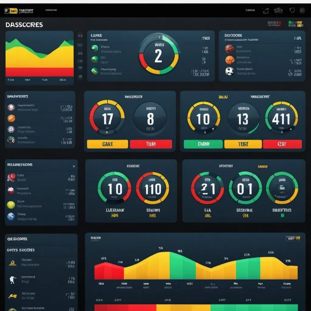
Create a dynamic and visually engaging illustration of a sports scores dashboard. The dashboard should display live scores from various sports, including football, basketball, soccer, and baseball, with each sport section clearly labeled. The layout should be sleek and modern, resembling a high-tech digital interface with widgets and panels for each sport. The background should incorporate energetic patterns and bright colors like blue, red, green, and yellow to reflect the excitement of live sports. Include elements like team logos, player stats, and mini game summaries to add depth to the dashboard. Surround the main dashboard with subtle hints of cheering fans and sports equipment to enhance the lively atmosphere. The overall composition should capture the thrill of tracking multiple sports scores in real-time, with a focus on clarity, accessibility, and visual appeal
Create a dynamic and visually engaging illustration of a sports scores dashboard. The dashboard s... [more]
Model: OpenArt SDXL
Width: 1024Height: 1024
Scale: 7Steps: 25
Sampler: Seed: 1696419867

Create your first image using OpenArt.

With over 100+ models and styles to choose from, you can create stunning images.
More images like this
Prompt: ui elements vector health monitoring patient profile white background colorful  minimalist desktop single screen
Prompt: Executive summary PBI dashboard, multiple account visualization, GW, RM, SL, PL teams, team filters, accuracy view, productivity view, TAT view, daily Queue tracking view, professional, modern design, high-res image, business analytics, data visualization, clean layout, organized presentation, corporate color scheme, informative visuals, detailed charts and graphs, sharp and clear, professional lighting
Prompt: Create the best type of chart for the categorization of data with 20 types of catefories
Prompt: Create a dynamic and visually engaging illustration of a sports scores dashboard. The dashboard should display live scores from various sports, including football, basketball, soccer, and baseball, with each sport section clearly labeled. The layout should be sleek and modern, resembling a high-tech digital interface with widgets and panels for each sport. The background should incorporate energetic patterns and bright colors like blue, red, green, and yellow to reflect the excitement of live sports. Include elements like team logos, player stats, and mini game summaries to add depth to the dashboard. Surround the main dashboard with subtle hints of cheering fans and sports equipment to enhance the lively atmosphere. The overall composition should capture the thrill of tracking multiple sports scores in real-time, with a focus on clarity, accessibility, and visual appeal
Prompt: Create an image resembling a digital sports analytics dashboard, featuring graphs, charts, and numerical results for a football (soccer) match. The dashboard should display metrics such as goals scored, possession percentages, shots on target, and passing accuracy. Use a modern, sleek design with bold colors and clear visualizations to highlight the key statistics, providing a comprehensive overview of the game's dynamics and performance metrics
Prompt: an internal dashboard that allows key stakeholders to answer questions around supply, demand, and commercial reporting easily & quickly, requiring as linear a process for inputting as possible. Fun loud colours and fancy integrations.
Prompt: Create an image resembling a digital sports analytics dashboard, featuring graphs, charts, and numerical results for a football (soccer) match. The dashboard should display metrics such as goals scored, possession percentages, shots on target, and passing accuracy. Use a modern, sleek design with bold colors and clear visualizations to highlight the key statistics, providing a comprehensive overview of the game's dynamics and performance metrics
Prompt: Create an infographic ranking financial stock parameters from most important to least important. Use a professional design with a mix of dark and light colors. Include the following parameters in order: 1. ROE (5Yrs Avg) > 20% 2. ROCE (5Yrs Avg) > 15% 3. PE < Industry PE 4. Sales Growth 3 Yrs > 15% 5. Profit Growth 5 Yrs > 15% 6. PEG Ratio < 1 7. D/E < 0.5 8. Promotor Holding > 50% 9. Pledged % < 1 10. OPM > 15% 11. EV/EBITDA < 25 12. Price to Sales < 10 13. MCap > 1000 Cr. The infographic should include a brief explanation for each parameter, highlighting its importance." Name it as Arun Subramaniam’s stock screener
Prompt: MS Excel dashboard for family business, monthly expenses, personal, business, office, salaries, incomings, two farms, procurement company, bank account transfers, charities, lend money, professional, organized, clean design, business setting, modern, data visualization, financial management, high quality